Tuesday, May 18, 2010
Semester 2, Blog #5: Reflections on the Semester
Wednesday, May 12, 2010
Semester 2, Blog #4: Speaking with Animation
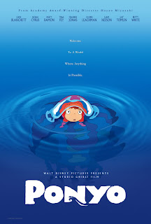
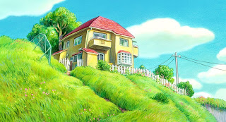
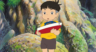
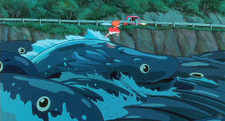
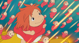
Elements of nature in the world of Ponyo take on new magical forms, especially Ponyo herself, who morphs between her fishy form and girl form. Furthermore, Ponyo in her “goldfish” form is not drawn literally like a fish, but more like how a little child might try to draw a fish: she has a face, a little tuft of hair, and her tail fin looks like a skirt. The look is both odd and delightful. In the film’s most acclaimed scene, even the waves of the ocean erupt into the form of giant blue fish and burst as they crash against the cliffs. The magical animation evokes the childlike curiosity of the main character, Sosuke, a five-year-old boy who lives by the sea. Sosuke stumbles upon Ponyo, a goldfish who gets stuck in a jar, and the two take a liking to each other, so Ponyo wants to become a human girl through the magic that is innate in her. It’s a slight and simple story about devotional love that unfolds on Miyazaki’s own terms, using a childlike “dream logic” rather than typical Hollywood-style story structure. In my mind, Ponyo is not about plot, it’s more about the subtext and the emotional impressions we (the viewers) experience in each scene. It’s an animated film that speaks to the kid in our hearts.
Semester 2, Blog #3: Video Production Notes
Monday, March 1, 2010
Semester 2, Blog #2: Editing Analysis
The music video for Adam Lambert’s song “For Your Entertainment,” directed by Ray Kay, is an excellent example of how editing style can impact the feel of a video piece. Like many contemporary music videos, it is essentially a montage comprised of shots from numerous scenes that are intercut and juxtaposed in a complex way that evokes the thematic content and rhythms of the song, rather than telling a straightforward narrative. The scenes ostensibly take place in a shady yet high-fashion underground club with ornate décor and dim reddish lighting.
In the introduction of this suggestive song, we see shots of Lambert entering this club with his entourage through a brick hallway and past a curtain, after which he begins singing amongst a group of extras who are all mingling rather erotically about the club. The rhythm of the cuts begin to take on the rhythm of the electronic pulses of the song itself, as we see rapid closer-up shots of extras dancing, embracing, or writhing erotically, intercut with shots of Lambert (in a few different settings) singing aggressively to the camera. This rapid cutting enhances the sense of eroticism and visual stimulation to complement the pulsing beat and suggestive lyrics of the song. As soon as the song hits the chorus, the video cuts to a rousing choreographed danced scene, with Lambert in the center surrounded by background dancers. This scene was shot from various angles, and the video continues the rapid cutting style by switching from one angle to another.
When the song gets to the second verse, we then see various close-ups of Lambert walking through jungle-like bushes while his “sexual minions” reach out with their hands and plead for attention from within the foliage, as he continues to sing, sometimes to the camera and sometimes to the people surrounding him. There are also some quick shots throughout of Lambert holding a green snake, an appropriate symbol of temptation and seduction. Once the song again reaches the chorus, it cuts back to more of the choreographed dancing sequence. Soon the editing becomes more complex as it weaves the numerous threads amongst each other, with the video eventually culminating in a chaotically shot sequence with Lambert and his band rocking out before an audience. The continually quick cuts and blurry imagery in “For Your Entertainment” are somewhat disorienting, but you get the sense that’s how director Ray Kay wanted it to feel.
Check out the video below, or click here to see it larger.
Thursday, February 18, 2010
Semester 2, Blog #1: User-generated Content
I use the internet on a daily basis, and most of the media of which I partake is user-generated content. What I most enjoy about the internet is how it offers limitless opportunities for users to express their creativity, share information, and interact with other people who share common interests. A prime example of user-generated content is YouTube, which contains a great variety of video content uploaded by users, from mindless viral videos, to clips of entertainment professionals, or TV and movie clips, or even intelligent, educational documents. I visit YouTube frequently primarily to watch clips of my favorite performing artists. Sometimes the endless amount of entertainment can actually become addicting, and that’s the negative side to having so much content at your fingertips. Another site I like that features user-generated content is DeviantArt, where users can publish their artwork to share freely with others. I use DeviantArt just to enjoy other people’s original artwork and fan art, but I haven’t yet put up any of my own work. My relationship with media on sites such as YouTube and DeviantArt is merely as a consumer (for now), since I don’t like the idea of putting up my work to be judged by users. People post hateful, rude, or malicious comments more often than not (especially on YouTube), and that can make these sites a very frustrating interactive experience. Other sites I often visit are fan-made websites dedicated to singers, actors, anime series, or other interests I have. These sites play a big role in deepening my love and understanding of various artforms and their artists, and connect me to other fans with similar passions. If it weren’t for websites created by fans, I would know next to nothing about my favorite films, TV series, or singers, nor would I have much of an avenue for my “fandom.”
Wednesday, November 25, 2009
Design I Like: "Castle in the Sky" Poster

One of my favorite movie posters is for a classic Japanese animated film called “Castle in the Sky” (1986) by my favorite director Hayao Miyazaki. The poster is immediately striking for its vibrant, warm colors and complex imagery. It has a strong look of fine artistry that is rarely seen in the vapid movie posters of today, but there is also something to be said for it as a functional piece of graphic design. The two main characters, the boy Pazu and the girl Sheeta, are featured prominently in the poster floating high above a canyon landscape and gazing upwards with smiling faces that convey a sense of optimism and wonder. Flying below them, but still high above the village in the canyon, there is the pirate airship and several of its pirates on board, who start out as pursuers of the main characters in the movie but end up forming an unusual friendship with them. This spectacular and unexpected aerial perspective serves to grab people’s attention and give them a sense of the adventure they can expect when they watch the film. The fact that the two main children’s faces are featured very near the center of the frame also accentuates their glowing expressions and indicates who the main characters are. The magical stone on Sheeta’s necklace is also glowing in the center near her face, perhaps representing the idea that this jewel is indeed the “MacGuffin” of the film’s story. The bright colors on the children’s clothes, in contrast to the brown tones of the pirate ship and village below, separate them from the background and also suggest how their grand adventure brings them to wondrous new places far removed from the industrial-looking village that they leave behind.
Wednesday, November 11, 2009
What I See: Where the Wild Things Are
Where the Wild Things Are is one of the most special films made in recent history. In adapting this beloved children’s picture book, Director Spike Jonze defied convention by creating a darkly affecting and visually rough movie about childhood that proves especially resonant for those of us whose childhood is a bittersweet memory. Jonze, cinematographer Lance Acord , and production designer K. K. Barrett created a dynamic mise-en-scene that is both remarkably naturalistic and fantastical. The film begins and ends in “the real world”—a very recognizable suburban environment, a place in which the rowdy Max finds little solace, stimulation, or companionship. To evoke Max’s disenchantment, it takes place in winter, a season that holds both the promise of fun times in the snow, or the disappointment of being left out in the cold. The beginning outdoor scenes are lit ostensibly by a gray overcast sky that gives the feeling of a cold and gray world, as Max plays alone in the snow. Later at night, the interior of Max’s house is unevenly and dimly lit while Max is isolated in his room.
The fantasy world of the Wild Things is dynamic and ever-shifting. It is painted mostly in earth tones—shades of brown, tan, gray, and muted green—but is occasionally broken up by bright colors. The texture in these scenes juxtaposes the coarseness of bark with the softness of fur. Joy, bliss, fear, and sadness are experienced as extremes in this world, reflecting the inconstant emotional nature of childhood. Jonze and Acord chose to shoot Wild Things mostly with a handheld camera, and apparently without the aid of a Steadicam. The shaky camera is used to heighten these various emotions and evoke spontaneity, as if the camera were documenting real experiences. In particular, the rough camera work is meant to generate chaos and energy during Max’s rambunctious behavior at home or when he and the Wild Things are playing one of their wild games. However, I have to say, although I understand why Jonze and other filmmakers want to use the “shaky camera,” I don’t like it because it’s distracting. I feel that the most stunning moments in Where the Wild Things Are occur when the camera is held still. The movie’s beauty lies in what’s happening beyond the camera itself.